Dashboard – Visual Item – Heat Maps
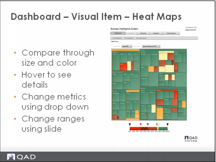
The heat map allows you to compare information displayed through size and color. Hover the
cursor over areas to see details about individual rectangles. Change the size and color metrics by
using the corresponding drop-down list in the upper part of the window. Change color ranges by
using the range slide at the bottom of the window. Click and drag the desired color triangle to the
appropriate value.
In the example each rectangle is a sales dollars month-to-date. A large rectangle equals relatively large Total Sales.
Red rectangles mean the Sales Quota has not been met