QAD 2016 Enterprise Edition Training Guides
>
Financials-Advanced
>
Screen Customization
>
General Process Flow
General Process Flow
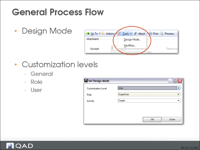
Design Mode lets you add, move, or remove fields, and modify field properties. In addition, you can create predefined column views for screens that contain grids.
The customizations you create apply to either yourself, all users that belong to your default role, or all users in the system. This is determined when you save the customization.
You access design mode by selecting Design Mode in the Tools menu in the screen that you want to customize.
When you select Design Mode, the system prompts you to choose a customization level.
1 Choose the level for the customizations:
General. The customizations are effective for all users.
Role. The customizations are effective for all users with the same default role as you.
User. The customizations are effective for you only.
2 If you chose the Role customization level, select the role for which the customizations apply.
3 Select the component activity for which the customization applies; for example, Create, Modify, or Delete.
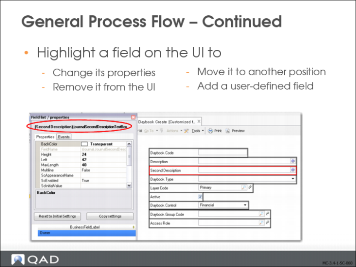
In Design Mode, a gray border is displayed around all fields. When you select a field, its border color changes to red. By selecting the border, you can drag and drop a field or modify its properties.
Moving Fields to Other Tabs
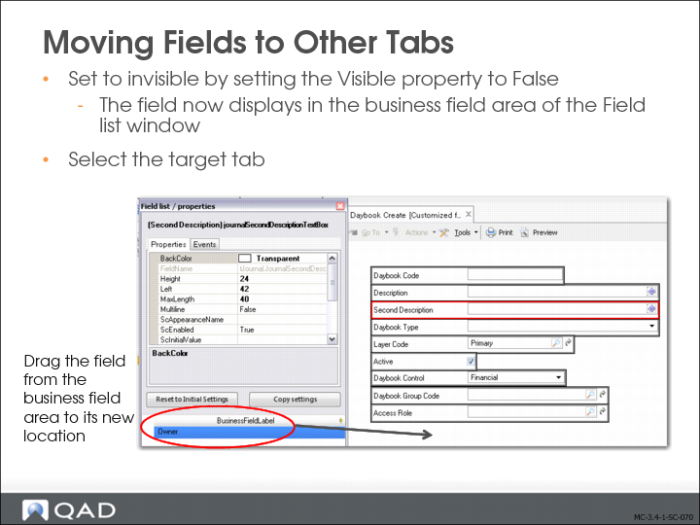
You can remove a field from the UI by clicking on the field to activate it and setting the Visible property to False.
The field is then stored in the BusinessFieldLabel pane of the design fame. To return the field to the UI, click it and drag it from the BusinessFieldLabel pane to the screen.
You can move a field within the UI by dragging it to its new location or by modifying the position properties. You cannot drag a field from one tab to another. To reposition a field to a new tab:
1 Set the Visible property to False. The field now displays in the business field area of the Field List window.
2 Select the target tab to activate it.
3 Drag the field from the storage area to its new location.
Field Properties
The Field list/properties window displays the properties that control the appearance of the selected field.
The window contains two tabs, Properties and Events.
Field Descriptions
BackColor
Specify the color schema for the field. The system applies any color modifications you make to the field border, and not the actual input zone.
Modify the numeric red, green, and blue properties of the field, or select a color from the drop-down list.
Height
Specify the height of the field (label and input zone) in pixels.
Left
Specify the field position in pixels, relative to the left of the screen.
Max Length
Specify the maximum length of the field.
ScAppearanceName
Specify a user-defined setting from the Appearances.xml file to apply to the field. The Appearances.xml file contains settings for color, shadowing, and alignment.
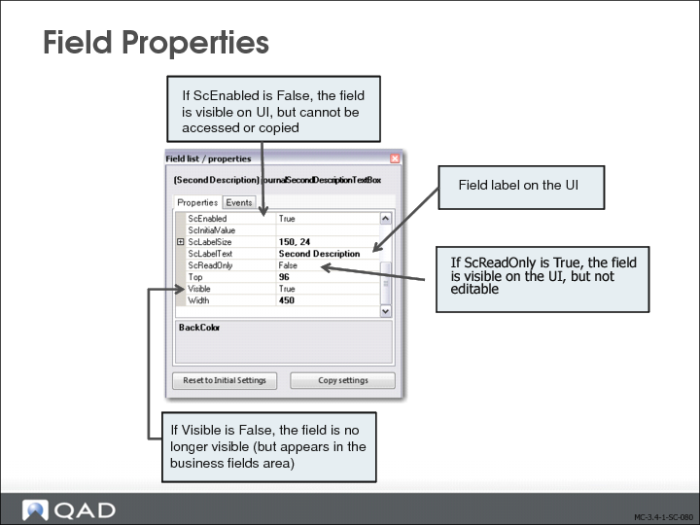
ScEnabled
Specify True or False to enable or disable the field.
If you set the property to False, the field continues to display on the screen, but it is no longer accessible in the UI. It cannot be tabbed to and its value cannot be copied.
ScInitialValue
Specify the initial value of the field. This field can be used for defaulting when several possible values exist, for example, a daybook in Supplier Invoice Create.
ScLabelSize
Specify the amount of space in pixels (width and height) to allocate to the field label.
ScLabelText
Specify the label text for the field.
ScReadOnly
Select True or False from the drop-down list to indicate whether the field is read-only or editable. When set to True, the field cannot be updated, but can be tabbed to and its contents can be selected and copied.
Top
Specify the field position in pixels, relative to the upper left corner of the screen.
Visible
Select True from the drop-down list to make the field visible on the UI. Select False to hide the field (including the label).
Note: Fields that are hidden from the UI are listed in the BusinessFieldLabel section of the design window.
Width
Specify the width of the field (label and input zone) in pixels.
BusinessFieldLabel
This section of the design window lists fields that have been hidden on the UI or user-defined fields that have been defined but not yet placed on the UI.
Use the two buttons as follows:
Reset to Initial Settings resets the properties of the field to the initial settings shipped with the application. The system prompts you to confirm the reset operation.
Copy Settings copies the properties of the selected field to another customization level. You can choose the level and the role or user, if applicable.
To apply your customizations to the UI, choose Tools and Design Mode.
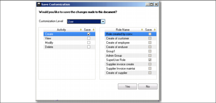
The system prompts you to confirm the changes and lets you select other activities for the business component to which to apply the customizations.
Field Descriptions
Customization Level
Select the level at which the customization applies.
Activity
The Save Customization screen lets you apply your customizations to other screens related to the function you customized. This varies depending on the activities defined for each component, but you can typically apply your customizations to the following screen types:
Create: Select to apply your layout customizations when the screen is used to create a new record.
View: Select to apply your layout customizations when using the screen to view a record.
Modify: Select to include your layout customizations when using the screen to modify a record.
Delete: Select to include your layout customizations when using the screen to delete a record.
Role Name
Select the roles for which the customizations apply. These fields are activated when you select Role in the Customization Level field.
Click Yes to apply the changes to the selected activities. Click No to close the screen without applying the changes.
Field Properties, Events Tab
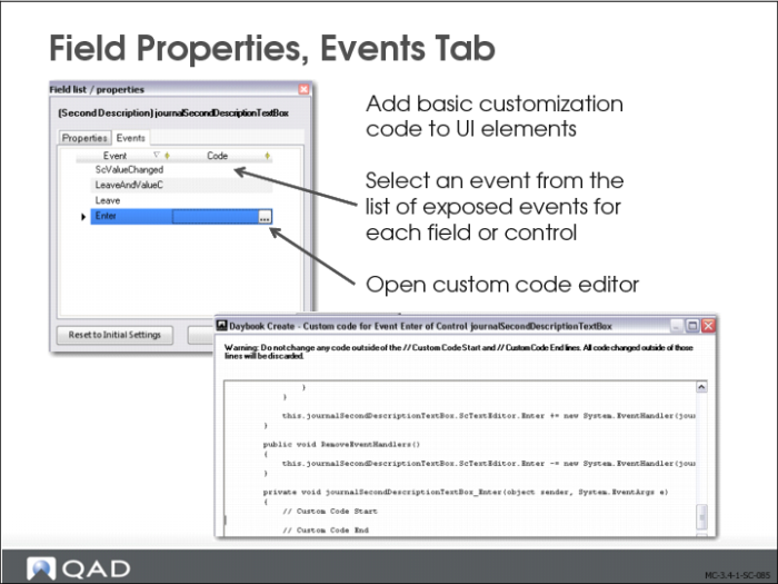
The Events tab lets you use the events and properties of UI controls to add basic customization code to UI elements. Examples of events include the following:
• Enter, which controls the behavior of a field when it gets focus.
• Leave, which controls the behavior of a field when the field loses focus.
You can select an event from a list of available exposed events for each field or control on the screen for which you are using Design Mode. For any event you select, you can alter the properties of other fields and controls, and specify conditions under which the properties must be altered.
In the Events tab, the list of events is sorted alphabetically. When you select an event, a button appears to the right of the event in the Code column. Click this button to open an editor in which you can build a condition and an action (in the case of True or False values).
In the Custom Code for Event editor, you can customize the code using non-intrusive customization.