How QAD supports continuous improvement
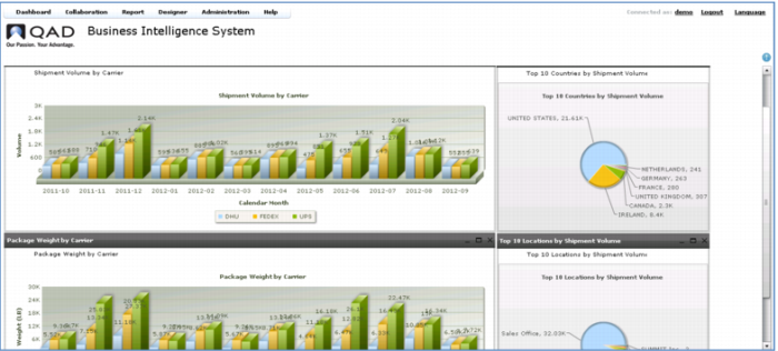
Shipment Volume Summary Dashboard
The last dashboard is the Shipment Volume Summary – presenting shipping statistics in terms of volume and package weight by carrier, along with the top 10 countries and locations.
High impact graphics like bar charts and pie charts quickly focus your attention to critical issues and help you identify trends.
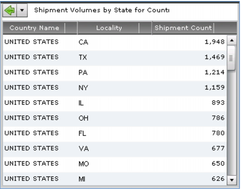
When you want more information, just click to drill down to the detail. For example, taking the top country by shipping volume (the US) and drilling down to a ranking by State.
Detailed information such as this helps you make better decisions – for example, you may leverage particular patterns to choose different carriers or zones. For example, if you notice that you ship a large volume of packages to the same or similar destinations, you might be able to zone-skip (or country-skip) and reduce cost.
Demo
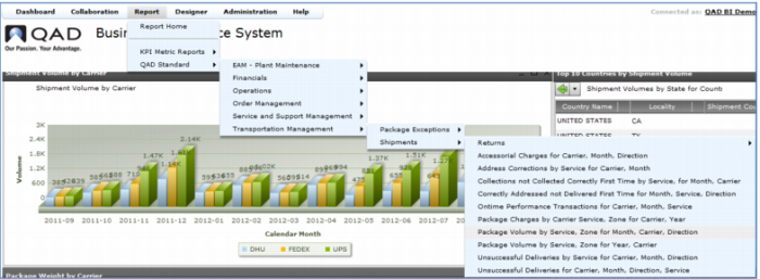
1. Select Dashboard > QAD Standard > Transportation Management > Shipment Volume Summary
2. In Top 10 Countries by Shipment Volume, click US
Key Points
• Shipping volume analysis
• High impact graphics
o Bar charts
o Pie charts
• Summary with drill-down
• Charts or reports
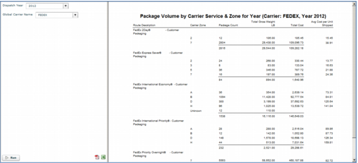
Reports
The lowest level of drill down from a dashboard will typically be a detailed report. You can also access reports directly from the Reports menu. Here is an example of a commonly used report, a breakdown of shipping volumes by weight by carrier. The UPS Shipment Volumes by Weight Category report shown here resembles the output of a UPS rate sheet, useful for renegotiation of carrier rates. QAD Business Intelligence includes a variety of pre-defined reports. You can use the Report Designer to modify any of these reports or add others specific to your operations.
Demo
Key Points
• Various pre-defined reports; Can add/change reports using Report Designer