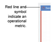
Dashboard Colors
Colors show the source for each of the panels and, in the case of operational metrics and browse-based panels, show how actual performance compares to preset limits. Colors indicate the source of the panel data. A thin color line on the border as well as the color of the symbol adjacent to the name indicate the source of the data in the panel. For EAM, all panels are operational metrics and display a thin red line.
Panel Source Colors
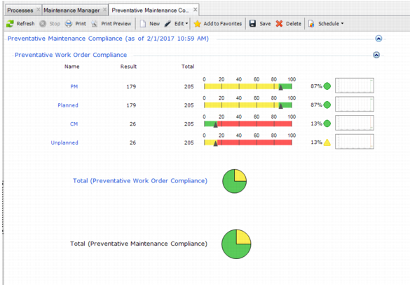
Operational metrics are shown as pie charts or sliders. Colors displayed within the operational metric panels indicate the following:
• Green indicates good performance.
• Yellow indicates fair performance but with a caution to watch the performance.
• Red indicates the metric is in poor performance.
Important: Each operational metric has a different user-set range—or threshold—for green, yellow, and red.
The Total pie chart indicates the percentage of results for the whole metric group that appear in each color band. In
Dashboard Colors, 75% of results appear in the green band and 25% appear in the yellow.
Dashboard Colors